This case study describes my examination and redesign of NC Dental Board's website for improved responsiveness.
UI/UX Designer and Front-End Developer
March - April 2024
Figma, HTML, CSS
'Responsive' websites use HTML and CSS to automatically resize or rearrange their content as the screen's dimensions change. Many high-profile websites prioritize responsiveness, however, many others with less resources for development and maintenance do not react to screen dimensions.
I chose one such website, the homepage for the North Carolina State Board of Dental Examiners (NCSBDE), and redesigned its homepage to priotize responsiveness.
I chose the NCSBDE website because it provides important information that pertains to many North Carolina citizens, however, the site's usability is impeded by its lack of responsive design. By identifying flaws with its design and iteratively building a more responsive version, I will practice holding responsiveness at the center of the design process.
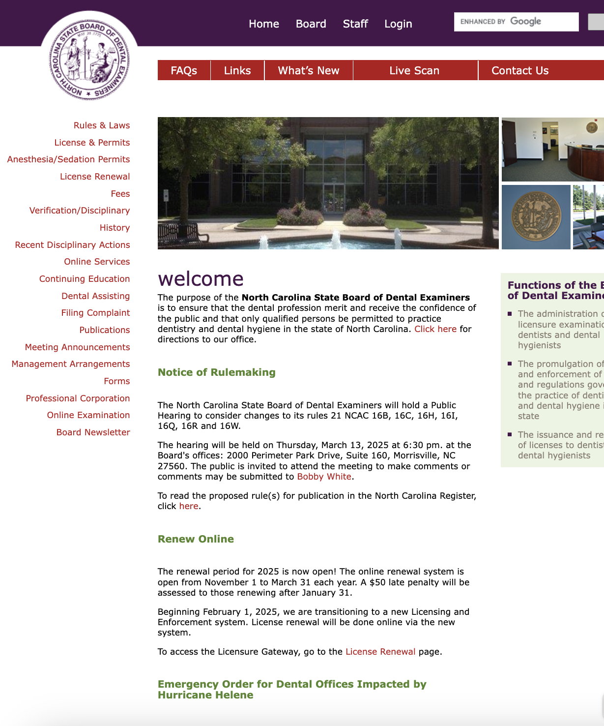
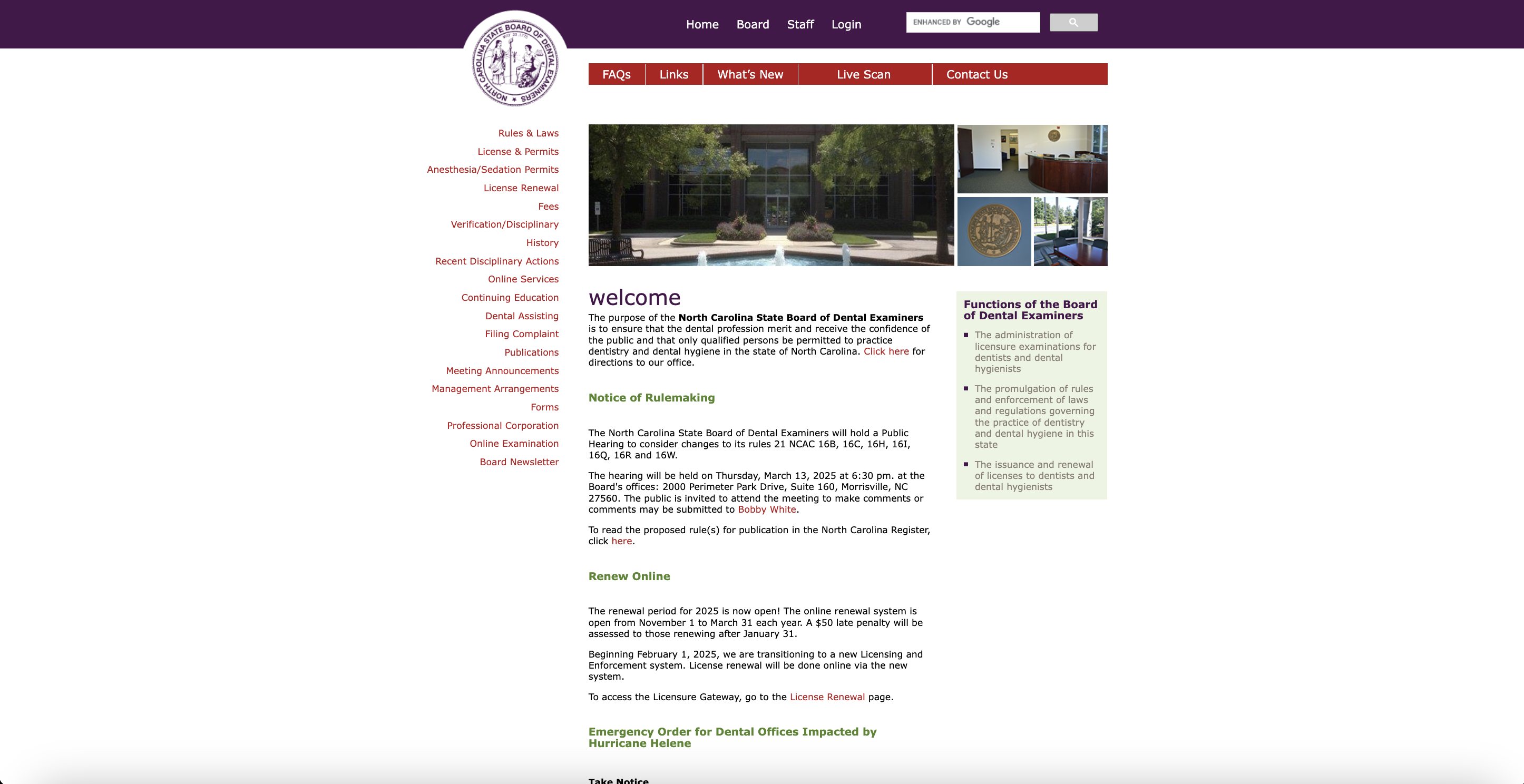
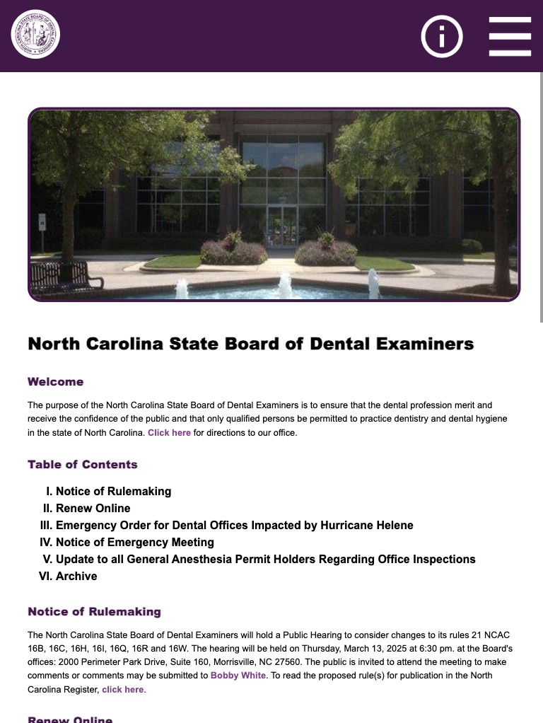
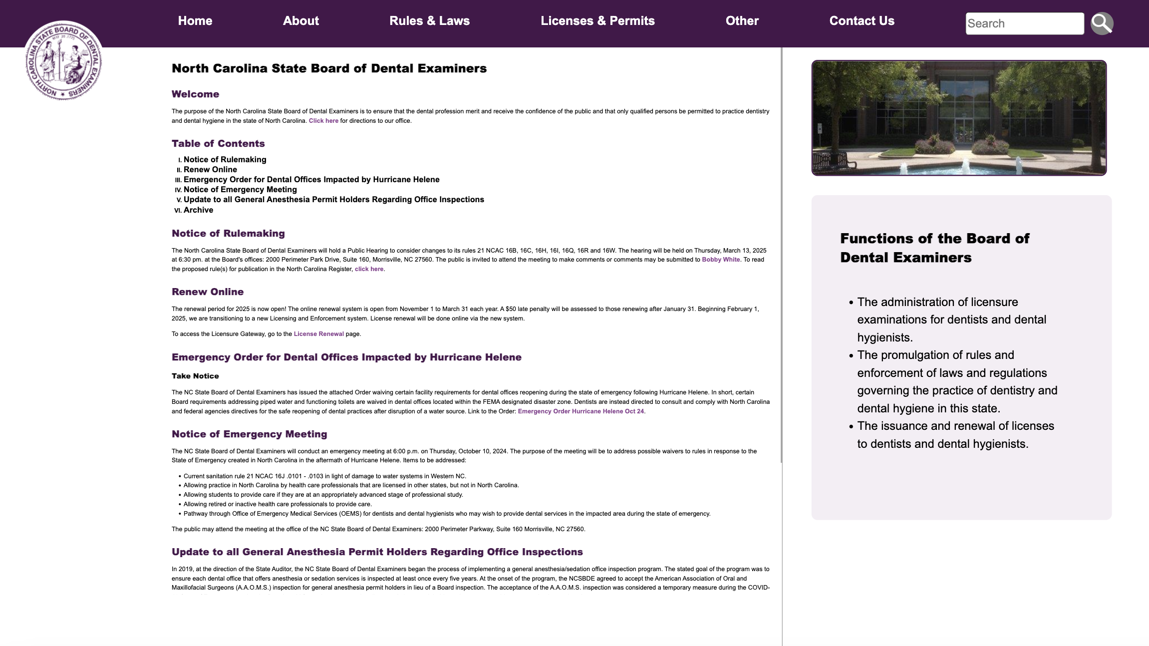
The screenshots below display the current NCSBDE website at various screen widths (375x667px, 768x1024px, and 3840x2160px). These screen widths represent the view on mobile, tablet, and computer respectively. As shown, the website does not consistently resize or rearrange its content depending on screen size, and instead, content often gets cut off on mobile. And, on the computer, the screen has an awkward amount of padding on the left and right.
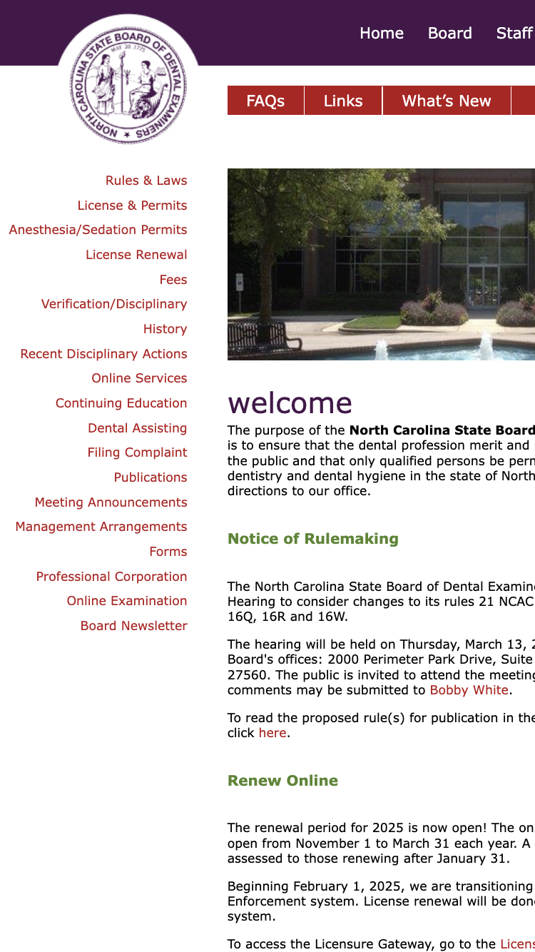
Mobile (375x667px)
Tablet (768x1024px)
Computer (3840x2160px)
After exploring the NCSBDE homepage, I compiled this table of the usability (learnability, memorability, and efficiency) and accessibility issues I identified with the website. To detect accessibility issues, I used the tool WebAIM WAVE, which automatically detects possible accessibility problems.

WebAIM Wave discovered many accessibility issues:
As described, the NCSBDE website suffers from a variety of learnability, memorability, efficiency, and accessibility issues. The common themes are the confusing nature of the 3 separate nav components, the lack of color coordination, the long height of the page and lack of structure, and the lack of responsiveness to narrow screens.
Addressing each problem would improve the user experience for all users, not just for new users or those needing specific accessibility features.
After identifying these usability and accessibility issues, I redesigned the homepage of the NCSBDE website with these concerns in mind. Before recreating the website with HTML and CSS, I created a visual design style guide and mockups with the design tool Figma.
This style guide contains the main colors, typography, and reusable components for my mockups and redesigned webpage. Creating a consistent palette and matching components improved the coordination and cohesion of my final redesign, and ideally improves the user experience.
The following mockups display my redesign of the NCSBDE home page on mobile, tablet, and desktop screens. This redesign prioritizes responsiveness by reusing styling, layout, and components between screen sizes, while still adjusting to new proportions.
My redesigns attempt to address the usability and accessibility issues I identified earlier in the following ways:

The final deployment of my redesigned NCSBDE website can be found here. The screenshots below display the redesigned website on mobile, tablet, and computer screens.
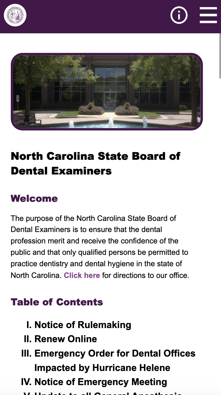
Mobile (375x667px)
Tablet (768x1024px)
Computer (3840x2160px)
This redesign was a valuable exercise in critiquing the usability, accessibility, and responsiveness of an existing website, and then putting my observations into practice. I used tools like WebAIM WAVE for the first time, which I will continue to use to find inaccessible parts of my own websites and existing ones. Generally, I found it valuable to examine the tradeoffs necessary when building a website, and how to justify these choices through several iterations.
I found it suprising how many important websites like the NCSBDE homepage lack responsive features, impeding the user experience and making actions more difficult. However, it is easy to complain about how unresponsive and awkward a website's interface is. But, as I learned, building a responsive website is not at all simple, and takes careful thought, planning, and iteration.
Overall, this case study was an opportunity for me to grow my accessible and responsive design skills through several rounds of iteration with several tools, from Figma to code.